6. Change Detection
In this section, you will apply Remote Sensing to integrate data to detect changes in geographic phenomena. Read about it on the learning path  Change Detection.
6.1. The Sistan Basin
In this exercise, you will work with spatial data from the Sistan basin; a wetland area on the borders of Iran and Afghanistan. The watersheds this basin consist of a system of rivers that flow from the Hindu Kush Mountains in Afghanistan through freshwater lakes, and then to a saline depression in Afghanistan; the final destination of the rivers. See Fig. 6.12
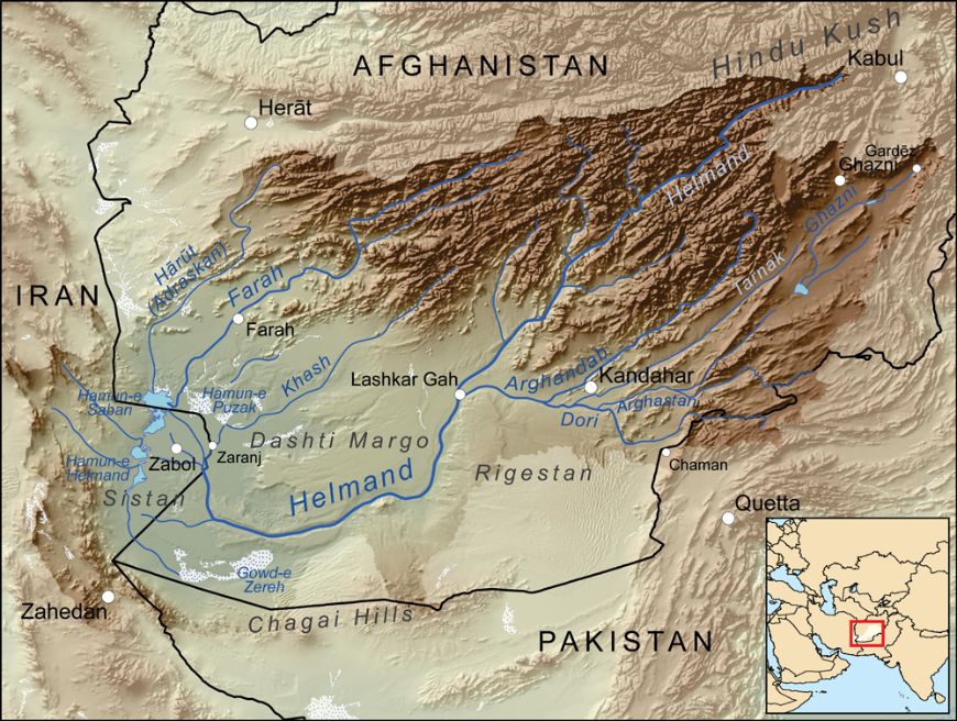
The lowest parts of the basin are covered by wetlands, known as Hamoun wetlands. The wetlands cover about \(4500 \ Km^2\), they are located in one of the driest regions in the world, such an area suffers from prolonged droughts. The droughts endanger the livelihood of about half a million inhabitants, including fishers, farmers, and others. Therefore, the monitoring of the water and vegetation is of prime importance for that ecosystem [WC2020].
- WC2010
Kmusser. (2010, May 13). Map showing the Helmand River drainage basin. In Wikipedia, The Free Encyclopedia. Retrieved 12:08, October 5, 2020, from https://upload.wikimedia.org/wikipedia/commons/4/48/Helmandrivermap.png
- WC2020
Wikipedia contributors. (2020, September 14). Sistan Basin. In Wikipedia, The Free Encyclopedia. Retrieved 12:08, October 5, 2020, from https://en.wikipedia.org/w/index.php?title=Sistan_Basin&oldid=978368838
Note
Reflection. Read the report Monitoring Environmental Change in the Sistan Basin. It is an optional activity, but it will give you a broader context about the Sistan basin in this exercise.
The Sistan basis is a large and complex ecosystem. In this exercise, we will only focus on the geographic area occupied by the Hamoun wetlands. Specifically, we aim to answer the question How the presence of water and vegetation changes over time in the Hamoun wetlands?
To answer such a question, we will perform a data analysis consisting of four steps:
Determine where the overall presence of water, wet soil, dry soil and vegetation concentrate.
Identify and compare seasonal changes in the presence of water, wet soil, dry soil and vegetation.
Quantify the differences in the presence of water between specific dates.
Quantify seasonal changes in the overall presence of water and vegetation.
Important
Resources. You will require the latest LTR version of QGIS (A Coruna 3.10), plus the dataset change_detection.zip which you can download from CANVAS. When you unzip the dataset, you will find several folders containing the following files:
vegetation.img- time series for the presence of vegetation in the Hamoun wetlands.
wet_soil.img- time series for the presence of wet soil in the Hamoun wetlands.
dry_soil.img- time series for the presence of dry soil in the Hamoun wetlands.
water.img- time series for the presence of water in the Hamoun wetlands.
limits.shp- a boundary of the Hamoun wetlands.
Quantifying_change.model3- a model to automate a data processing routine.
Difference_style.qml- QGIS style file.
Dry_soil_sum.qml- QGIS style file.
Vegetation_sum.qml- QGIS style file.
Water_sum.qml- QGIS style file.
Wet_soil_sum.qml- QGIS style file.
date-time.csv- a table with the acquisition dates for the time series.
change_detection.qgis- a QGIS Project loaded with some of the datasets listed above.
The spatial data for this exercise consists of four image dataset with \(37\) bands. Each of the bands contains a snapshot of the Hamoun wetlands for different acquisition dates; between January 2, 2005, and April 22, 2006. Each image dataset describes an index of the presence of one of four types of land cover used, for this analysis, as variables of environmental change:
vegetation,
dry soil,
wet soil, and
water.
The pixel values in each band range from \(0\) to \(1\), and they represent the percentage of the area of a pixel covered by a specific type of land cover. For example, a pixel value of \(0.42\) in the ‘vegetation’ dataset means that such a pixel is \(42\%\) covered with vegetation.
The appendix Sistan Basin Dataset contains a table with the acquisition dates for each band. The dates are also available in the date-time.csv.
- Task 1
Make sure you have the Value Tool and the Temporal/spectral profile plugins installed.
- Task 2
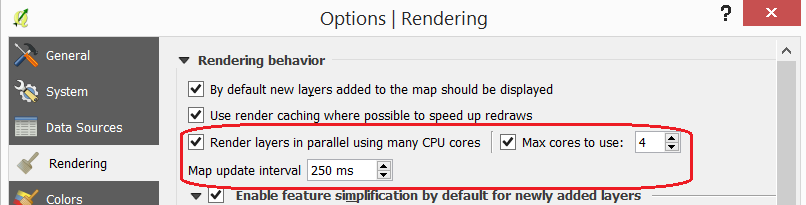
Make sure that QGIS is configured to render layers using multiple CPU cores. Go to Settings > Options > Rendering and make sure the option Render Layers in parallel using many CPU cores in on. Set Max Cores to the number of CPU cores in your computer, use at least 4 for better performance. See below.
6.2. Understanding the Data
The first step in every data analysis is to build enough understanding of the data involved. In this exercise, we will start by looking at the dates for the change detection analysis.
The datasets: vegetation.img, wet_soil.img, dry_soil.img and water.img, represent a time series with 37 snapshots, each snapshot is stored as a band, and each band contains values from \(0\) to \(1\) which represent indices of coverage.
- Task 3
Open the QGIS project
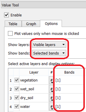
change_detection.qgisand make sure you have the Value Tool plugin visible and active.You will see the band \(1\) of each time series dataset displayed as pseudocolours. Band \(1\) contains values for January 2 of 2005; the starting date of the time series.
Note
Reflection. For the sake of comparison, switch the layers on and off and observe the values. For example, observe how the areas with high dry soil values have low wet soil values, and vice-versa. The Value Tool can help in such comparisons. Please do not rush this step; you must understand your datasets before proceeding with any analysis. Put special attention to the range of values in each layer and their spatial distribution.
Note
QGIS. The Value Tool allows you to control for which bands to plot the values. Make sure you are plotting only the values for the band \(1\) in each of the images; otherwise you will be plotting values for 148 bands (\(4 \times 37=148\)).
By now, you should have an idea of where the values for a particular variable are higher or lower on 02/Jan/2005. In the next step, we will build an understanding of where the values are high or low during the total length of the time series. This is, we will identify where such values reach global maximums and maximums.
6.3. Overall Concentration of Environmental Variables
To know where the presence of water, vegetation, dry and wet soil tend to concentrate during the time series; we will aggregate the values of all \(37\) bands.
- Task 4
Go to Raster > Raster Calculator… and add the \(37\) bands of each time series. Construct an Expression for the Raster Calculator using the formula below. Give meaningful names for each output file, for example vegetation_sum, water_sum, etc. See Fig. 6.13
"vegetation@1" + "vegetation@2" + "vegetation@3" + ... + "vegetation@36" + "vegetation@37"
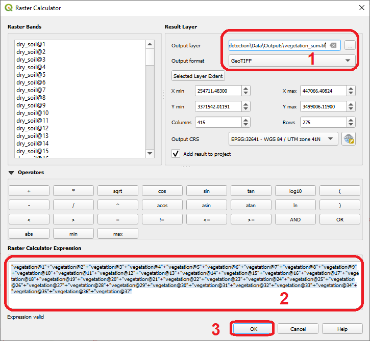
Fig. 6.13 Aggregation of values using the ‘Raster Calculator’
Note
QGIS. For convenience, you can copy the expressions listed below to the Raster Calculator Expression.
‘vegetation’ time series:
"vegetation@1"+"vegetation@2"+"vegetation@3"+"vegetation@4"+"vegetation@5"+
"vegetation@6"+"vegetation@7"+"vegetation@8"+"vegetation@9"+"vegetation@10"+
"vegetation@11"+"vegetation@12"+"vegetation@13"+"vegetation@14"+"vegetation@15"+
"vegetation@16"+"vegetation@17"+"vegetation@18"+"vegetation@19"+"vegetation@20"+
"vegetation@21"+"vegetation@22"+"vegetation@23"+"vegetation@24"+"vegetation@25"+
"vegetation@26"+"vegetation@27"+"vegetation@28"+"vegetation@29"+"vegetation@30"+
"vegetation@31"+"vegetation@32"+"vegetation@33"+"vegetation@34"+"vegetation@35"+
"vegetation@36"+"vegetation@37"
‘wet_soil’ time series:
"wet_soil@1"+"wet_soil@2"+"wet_soil@3"+"wet_soil@4"+"wet_soil@5"+"wet_soil@6"+
"wet_soil@7"+"wet_soil@8"+"wet_soil@9"+"wet_soil@10"+"wet_soil@11"+"wet_soil@12"+
"wet_soil@13"+"wet_soil@14"+"wet_soil@15"+"wet_soil@16"+"wet_soil@17"+"wet_soil@18"+
"wet_soil@19"+"wet_soil@20"+"wet_soil@21"+"wet_soil@22"+"wet_soil@23"+"wet_soil@24"+
"wet_soil@25"+"wet_soil@26"+"wet_soil@27"+"wet_soil@28"+"wet_soil@29"+"wet_soil@30"+
"wet_soil@31"+"wet_soil@32"+"wet_soil@33"+"wet_soil@34"+"wet_soil@35"+"wet_soil@36"+
"wet_soil@37"
‘dry_soil’ time series:
"dry_soil@1"+"dry_soil@2"+"dry_soil@3"+"dry_soil@4"+"dry_soil@5"+"dry_soil@6"+
"dry_soil@7"+"dry_soil@8"+"dry_soil@9"+"dry_soil@10"+"dry_soil@11"+"dry_soil@12"+
"dry_soil@13"+"dry_soil@14"+"dry_soil@15"+"dry_soil@16"+"dry_soil@17"+"dry_soil@18"+
"dry_soil@19"+"dry_soil@20"+"dry_soil@21"+"dry_soil@22"+"dry_soil@23"+"dry_soil@24"+
"dry_soil@25"+"dry_soil@26"+"dry_soil@27"+"dry_soil@28"+"dry_soil@29"+"dry_soil@30"+
"dry_soil@31"+"dry_soil@32"+"dry_soil@33"+"dry_soil@34"+"dry_soil@35"+"dry_soil@36"+
"dry_soil@37"
‘water’ time series:
"water@1"+"water@2"+"water@3"+"water@4"+"water@5"+"water@6"+"water@7"+"water@8"+
"water@9"+"water@10"+"water@11"+"water@12"+"water@13"+"water@14"+"water@15"+"water@16"+
"water@17"+"water@18"+"water@19"+"water@20"+"water@21"+"water@22"+"water@23"+"water@24"+
"water@25"+"water@26"+"water@27"+"water@28"+"water@29"+"water@30"+"water@31"+"water@32"+
"water@33"+"water@34"+"water@35"+"water@36"+"water@37"
Note
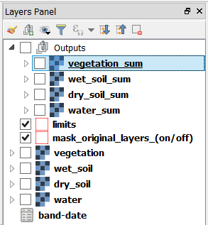
QGIS. Keep your project organized. The ‘change_detection’ project has a layer group named “Outputs”. Place the outputs you generate under this group or create more groups to keep the layer in your project organized. Also, keep the two vector layers always visible.
- Task 5
Change the Style for each of the layer you produced in the previous task, so that you can easily visualise where the values concentrate (i.e., where they reach their highest and lowest values). For the ‘vegetation_sum’ layer, go Right-Click > Properties… > Symbology > Style > Load Style… > search and select for the
vegetation_sum.qmlfile > Open > OK. See Fig. 6.14The styles you applied are only to facilitate a visual analysis. All the layers are divided into \(5\) classes but only the highest \(20 \%\) of values are visible. Such values identify areas where the presence of each index (variable) accumulates over period depicted in the time series.
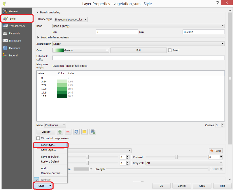
Fig. 6.14 Apply a style to the ‘vegetation_sum’ layer using a style file
- Task 6
Repeat the procedure above to change the styles of ‘wet_soil_sum’, ‘dry_soil_sum’, and ‘water_sum’ layers. Look for the correct style files in your data directory. Your project should now have the four aggregation layer properly styled. See Fig. 6.15
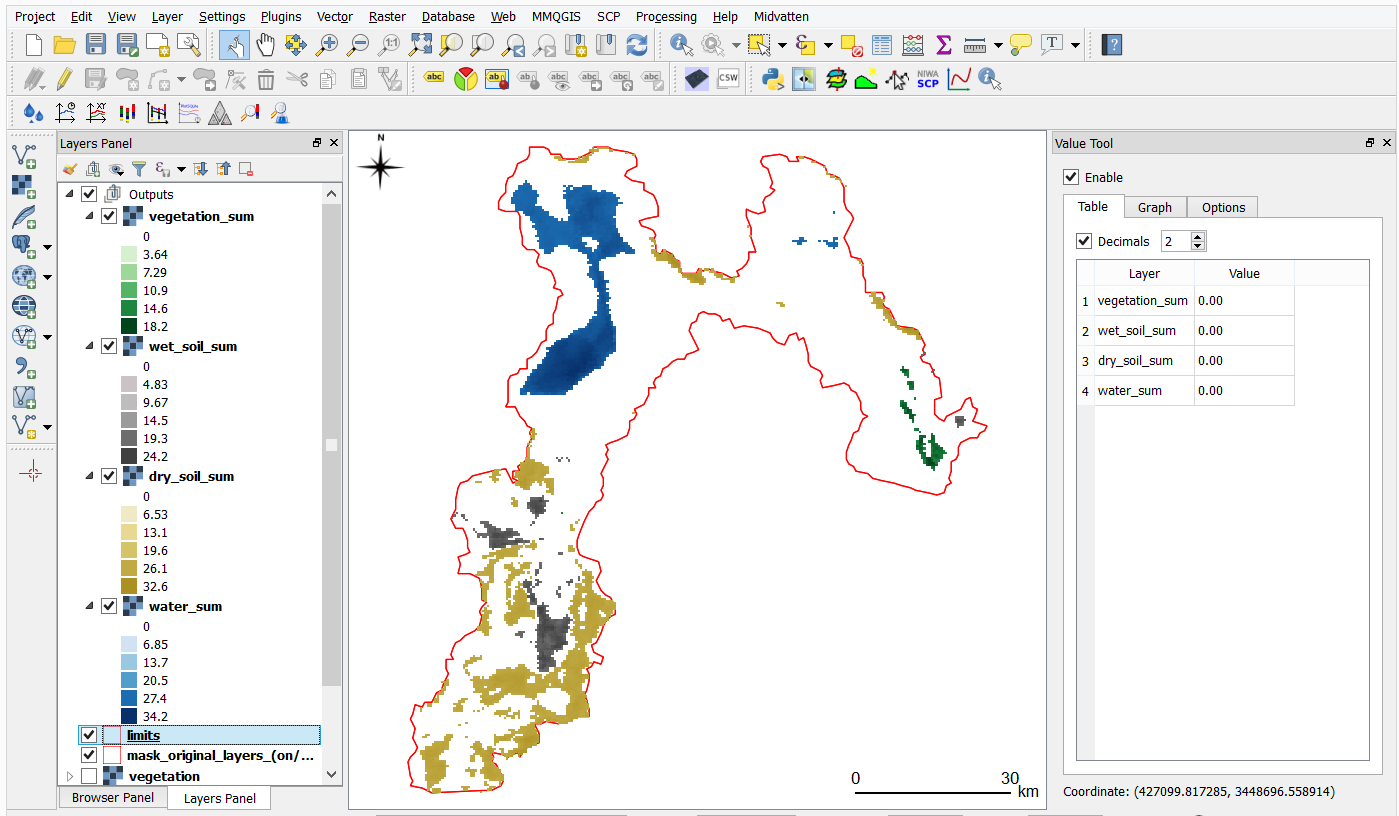
Fig. 6.15 The ‘vegetation_sum’, ‘wet_soil_sum’, ‘dry_soil_sum’, and ‘water_sum’ layers with custom styles
6.4. Identification and Comparison of Seasonal Changes
Now that you have an overview of the range and spatial distribution of value for each of the ‘index’ image. We will take a look at how the values change over time.
- Task 7
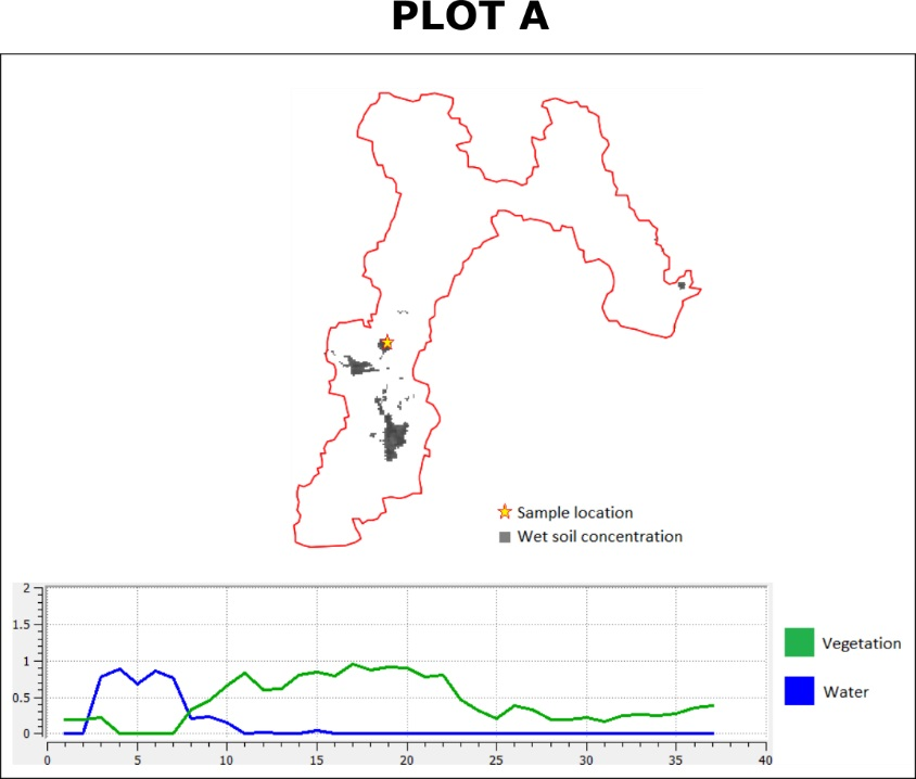
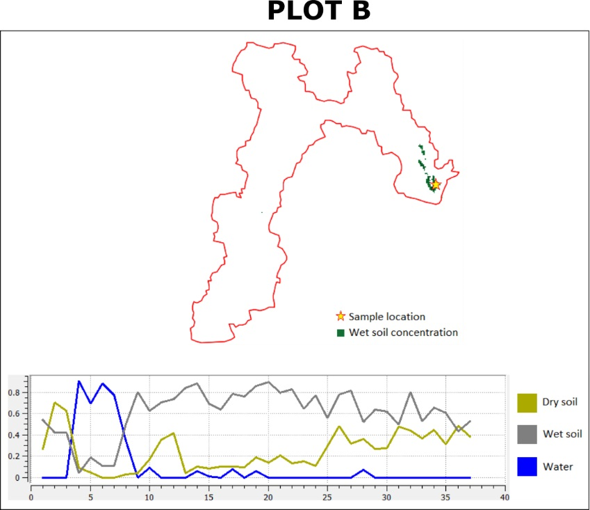
Use the Temporal/spectral Profile plugin to inspect how the values in the ‘water; layer change over time. Sample two or three points close to the areas where the values in the ‘aggregated’ layers are the highest. Watch the video tutorial on inspecting time series.
- Task 8
Use the Temporal/spectral Profile plugin to explore how the other variables change or compare over time.
Attention
Question. Observe the two plots below. For each plot, can you explain how the changes in each variable are related?
6.5. Quantifying Differences in the Presence of Water
In this section, we will quantify the changes in the presence of water. Specifically, we will look at how the values of the presence of water increase or decrease between dates. This variable is crucial because its behaviour influence the other three variables.
- Task 9
From the Processing Toolbox, Right-click on the tool Raster calculator > Edit Rendering Styles for Outputs…. See Fig. 6.16 Click the elipses (
...) > select theDifference_style.qmlfile > Open > OK.
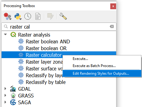
Fig. 6.16 The ‘Raster calculator’ in the Processing Toolbox
Note
QGIS. In the following tasks, you will use the Raster calculator to generate layers that compute the difference between two acquisition dates. Setting the tools to use the same style to render the output layers will make it easier to compare and understand the results, and it will save time.
- Task 10
Use the Raster calculator in the Processing Toolbox to compute the difference between band \(8\) (21/04/2005) and band \(12\) (22/06/2005) from the ‘water’ layer. Use the following formula to compute the difference map:
\[\Delta_{map} = Map_{(final \ state)} - Map_{(initial \ state)}\]
Do not forget to set the Reference layer(s) parameter to the ‘water’ layer, Fig. 6.17
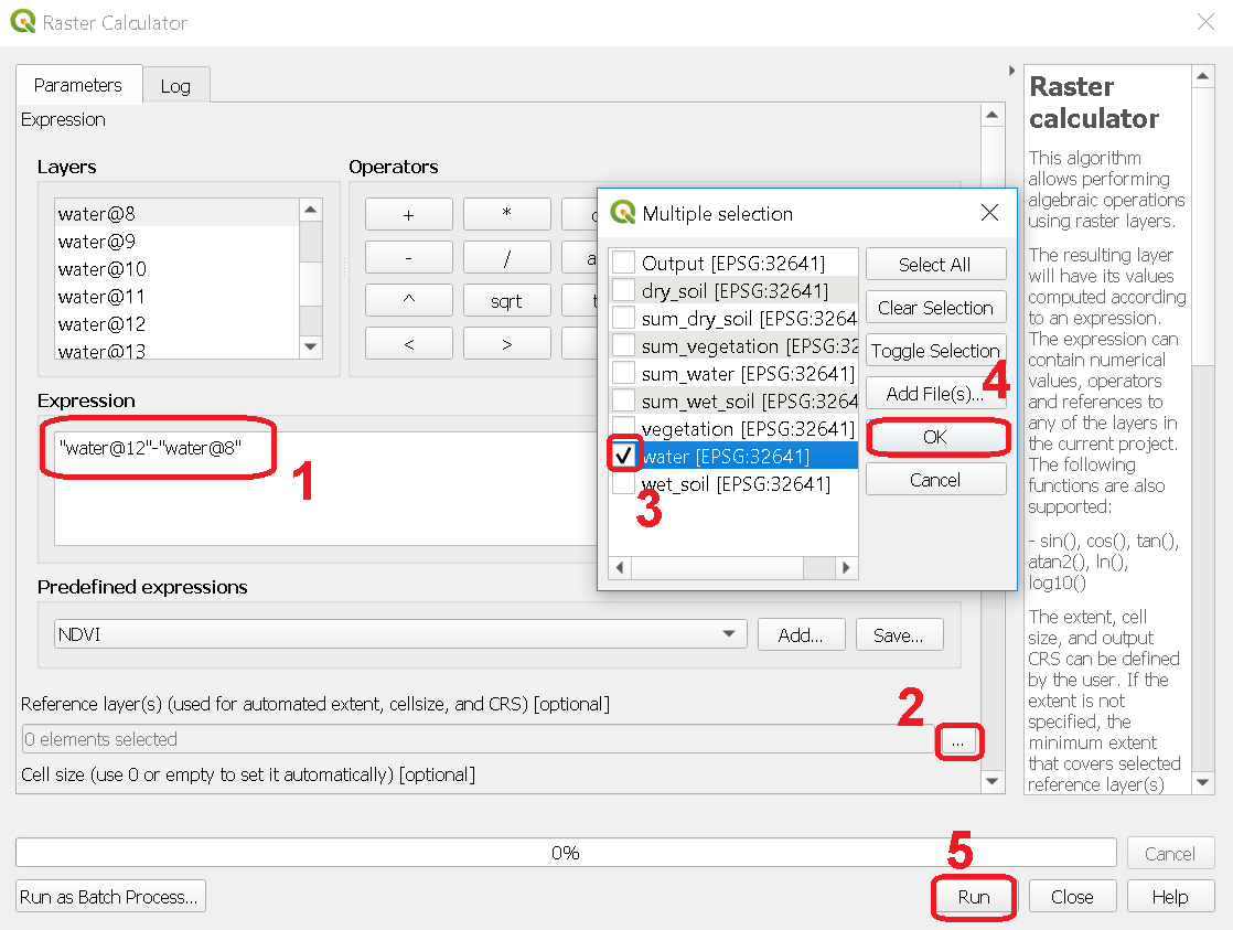
Fig. 6.17 Computing a difference map between bands of the ‘water’ layer
Attention
Question. Look closely at map resulting from the previous task. See below. What do the values of the difference map mean?
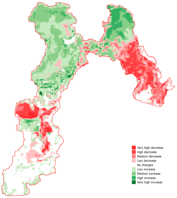
- Task 11
Repeat the procedure described in the previous task. This time compute the difference between band \(8\) (21/Apr/2005) and band \(20\) (12/Sep/2005) from the ‘water’ layer.
Attention
Question. Look closely at difference maps from the previous tasks. What changes occurred between April 21 and September 12 of 2005?
6.6. Quantifying Changes in Water and Vegetation
In the last part of this exercise, we will assess how the values change globally in the Hamoun wetlands over ten months; from January to October 2005. For this analysis, we consider the percentage of the total area of the basin covered by water. Earlier in the exercise, we explained that the index (\(0 \ to \ 1\)) represent the percentage of the area of a pixel covered by a specific geographic phenomenon, in this case, water. Therefore, the total percentage of area covered by water in a band \(T_{water}\), can be computed using the following equation:
Where \(A\) is the total number of pixels in a band, and \(B\) is the sum of the pixel values in that same band. The constant \(100\) converts the values to percentage.
To complete this part of the analysis, we would have to apply the equation above \(10\) times. One time per each month according to the table below.
Band (water layer) |
Date (Y-M-D) |
Date (M-Y) |
|---|---|---|
1 |
05-01-02 |
Jan-05 |
3 |
05-02-21 |
Feb-05 |
4 |
05-03-12 |
Mar-05 |
7 |
05-04-03 |
Apr-05 |
10 |
05-05-22 |
May-05 |
11 |
05-06-13 |
Jun-05 |
13 |
05-07-08 |
Jul-05 |
16 |
05-08-09 |
Aug-05 |
19 |
05-09-03 |
Sep-05 |
23 |
05-10-01 |
Oct-05 |
Instead of repeating the procedure to compute \(T_{water}\) over and over, you will use a predefined QGIS model which automate such a task.
- Task 12
Go to Processing Toolbox > Models > Add Model to Toolbox... See Fig. 6.18 . Select the model
quantifying_change.model3.
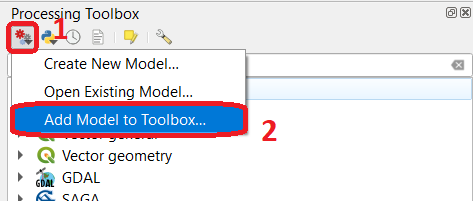
Fig. 6.18 Add model to ‘Processing Toolbox’
- Task 13
Us the model you just add to the Processing Tooolbox to compute \(T_{water}\) for the bands listed in the table above. Go to Processing Toolbox > Moderls > quantifying_changes, Fig. 6.19 . Double click on the model to open the model. For Extent and Indicator, select the ‘water’ layer. Click Run
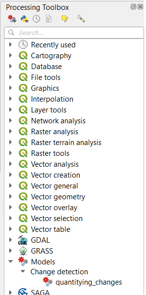
Fig. 6.19 The model ‘quantifying changes’ in the Processing Toolbox
Note
QGIS. The ‘Quantifying_change’ model outputs a band stack containing the values for \(T_{water}\). \(T_{water}\) is the total percentage of area covered by water per band (month). Therefore, you will notice that for a particular band, all the pixels inside the boundary of the Hamoun wetlands have the same value.
Besides computing the value of \(T_{water}\) for a band; the ‘Quantifying_change’ model creates a single-band raster to which it copies the value of \(T_{water}\) to all pixels inside the limits.shp. The model repeats this for each band in the table above, and then it combines all bands in a band stack called ‘OUTPUT’. After running the model, you should see the ‘OUTPUT’ stack in the QGIS project.
- Task 14
Use the Temporal/Spectral Profile plugin to inspect the values of the band stack created by the model, Fig. 6.20 Refer to Task 8 if you need to.
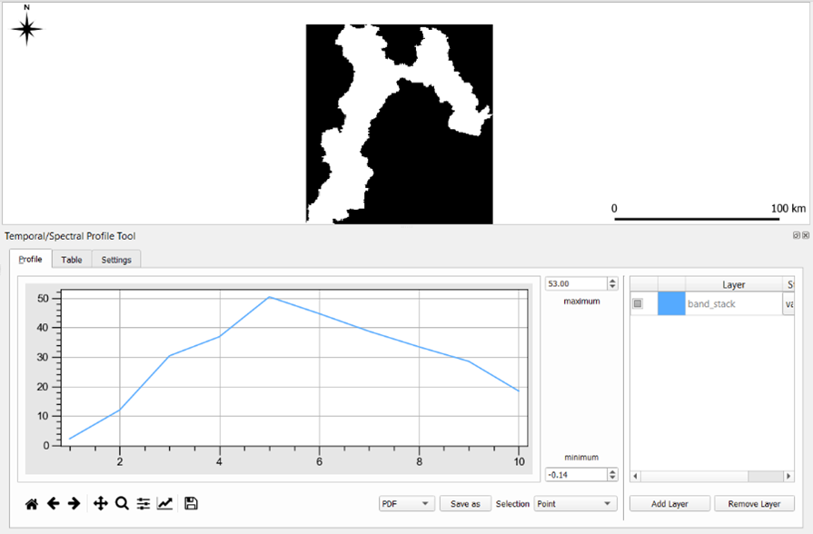
Fig. 6.20 Exploring the values of ‘total percentage of area covered by water’ with the ‘Temporal/Spectral Profile’ tool
Note
QGIS. QGIS will not preserve the original number of the bands in the output band stack. This means that you have to keep track of which band in the output stack corresponds to the bands in the original dataset. In this case, they correspond as following:
Original Band No. |
Band No. in Output Stack |
Month |
|---|---|---|
1 |
1 |
January |
3 |
2 |
February |
4 |
3 |
March |
7 |
4 |
April |
10 |
5 |
May |
11 |
6 |
June |
13 |
7 |
July |
16 |
8 |
August |
19 |
9 |
September |
23 |
10 |
October |
Attention
Question. Look at the line plot of the values of \(T_{water}\) in the Temporal/Spectral Profile tool. What does the profile curve show? How do we interpret the values?
- Task 15
Repeat Tasks 13 and 14 using another variable, for example, vegetation. Plot the profile curves in the Temporal/Spectral Profile plugin. Write down your observations and take them to the virtual classroom.
Section author: Zoltán Vekerdy, André Mano & Manuel Garcia Alvarez